
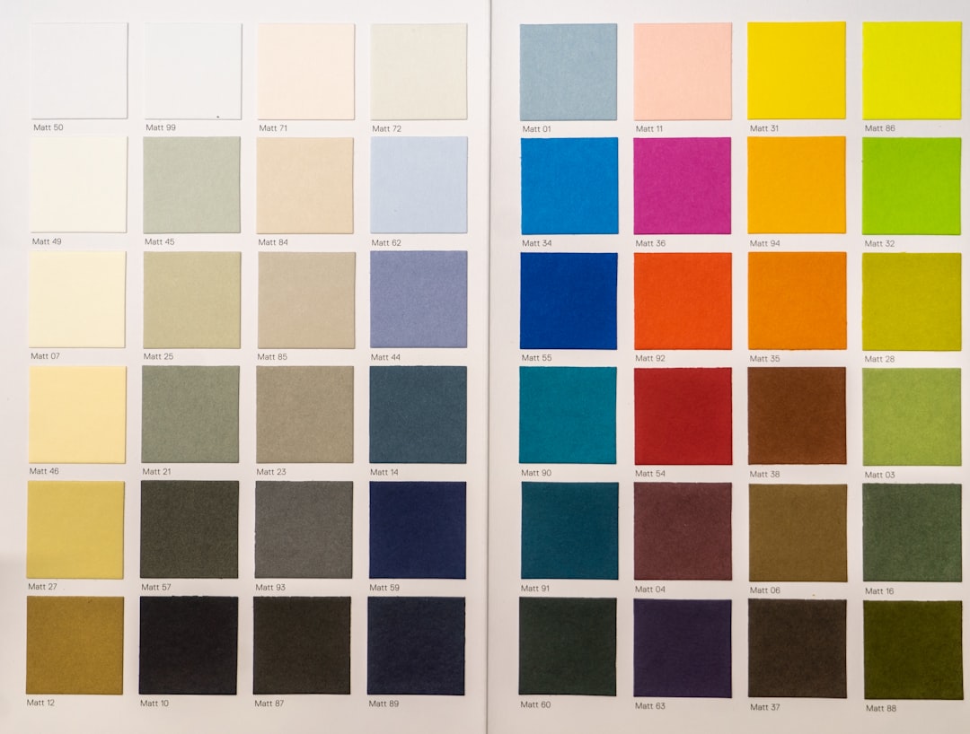
A considered home color scheme is what makes a house feel calm and connected rather than a collection of unrelated rooms. The colours you choose set the mood, control how large a space feels, and quietly tie one room to the next as you move through the home. Yet most people pick paint room by room, in isolation, and only later wonder why nothing seems to agree. A scheme planned across the whole home avoids that, and it is far simpler to get right than it looks.
This guide takes a practical, structured approach. We will cover a reliable rule for balancing colour, how to choose your dominant, secondary and accent shades, why undertones matter more than the colours themselves, and how to keep everything flowing between rooms. The principles work whether you favour soft neutrals or something bolder, and they apply equally to a single room and to a full renovation.
Start with the 60-30-10 rule
The most useful starting point for any home color scheme is the 60-30-10 rule. It splits a space into three proportions: roughly sixty per cent a dominant colour, thirty per cent a secondary colour, and ten per cent an accent. The numbers are a guide, not a law, but they keep a room balanced and stop any one colour from overwhelming the rest.
How the proportions break down
- 60% dominant: usually the walls and large surfaces, the colour you sit inside.
- 30% secondary: upholstery, curtains, larger furniture, a contrast that supports the dominant.
- 10% accent: cushions, art, smaller objects, the colour that adds life and energy.
Applied across the home, the rule gives you a framework rather than a fixed recipe. You might keep the same dominant in several rooms while changing the accent, which is one of the easiest ways to make a scheme feel coherent yet not monotonous.
Choosing your dominant, secondary and accent colours
With the proportions clear, the next step is choosing the actual colours. Begin with the dominant, because it sets the temperature of the whole home. Soft, muted shades make a flexible base; saturated ones make a statement but demand more discipline elsewhere. Once the dominant is settled, the secondary should sit comfortably beside it, neither competing nor disappearing.
Building from the base outwards
The accent is where you allow yourself some freedom. Because it occupies only a small share of the room, you can be braver here than anywhere else, and you can change it cheaply when you tire of it. This is the colour that personalises a scheme without committing you to repainting.
A common, dependable strategy is to keep the dominant and secondary calm and consistent throughout the home, then let the accent shift from room to room. Doing so keeps a sense of order while giving each space its own character. If you are coordinating a whole-home scheme as part of a larger project, our interior design notes go further on tying materials and colour together.
Warm versus cool, and the importance of undertones
Colours are not simply light or dark; they lean warm or cool, and they carry undertones that decide whether two shades sit happily together. A grey can lean blue, green or purple. A white can lean cream, grey or pink. These undertones are subtle on a swatch but obvious on a wall, and ignoring them is the single most common reason a scheme feels off.
Reading undertones
The practical test is to hold candidate shades against each other and against a clean white card. The undertone reveals itself by contrast: a grey that looked neutral alone may suddenly read distinctly blue beside a warmer neighbour. Decide early whether your scheme is warm or cool overall, then keep undertones in the same family so they harmonise. Mixing warm and cool deliberately can work, but only with intent, not by accident.
Anchoring the scheme to fixed elements
Paint is the cheapest thing to change, so it should follow your fixed elements, not lead them. Floors, worktops, tiles, brickwork and large built-ins are expensive and permanent, and they all carry undertones of their own. Choosing colours that fight these anchors guarantees disappointment.
What counts as an anchor
- Flooring: a warm timber, a cool tile or a greige carpet each pulls the scheme in a direction.
- Worktops and splashbacks: stone and tile often set the kitchen’s undertone.
- Joinery and built-ins: wardrobes, shelving and cabinetry you intend to keep.
- Architectural features: exposed brick, stone, or feature timber.
Pull your scheme out of these anchors and everything aligns. A warm oak floor invites warm-leaning walls; a cool grey tile invites cooler tones. If a renovation is on the horizon and you are choosing finishes from scratch, it helps to understand where the budget goes; our breakdown of renovation cost in Singapore puts the expensive, permanent decisions in context.
Testing samples in real light
No colour decision should be final until you have seen it in the actual room, at different times of day. Light transforms colour completely. The same paint can look fresh and bright by a north-facing window and heavy or muddy in a darker corner, and what charms you in the showroom may disappoint at home.
How to test properly
Paint large samples, at least an A4 patch, on more than one wall, and ideally on a piece of board you can move around the room. Look at them in morning light, in afternoon light, and under your evening lamps, because a scheme has to work in all three. Resist judging from a small chip or a screen; both lie about scale and undertone. Living with the samples for a few days is the cheapest insurance you can buy against an expensive mistake.
Coordinating flow across open-plan and adjacent rooms
In an open-plan home, or anywhere rooms are visible from one another, colour has to flow rather than jump. A scheme that changes abruptly at every doorway feels restless. The remedy is continuity: shared undertones, a repeated accent, or a consistent dominant that carries through sightlines.
Techniques for flow
You do not need to paint everything the same. Instead, choose colours from the same family and let them step gently lighter or darker between zones. Repeat one accent colour, perhaps through textiles or a single material, so the eye reads connection as it travels. Where one large space serves several functions, colour can quietly define zones without walls, an idea closely tied to architectural principles of proportion and rhythm. Done well, the whole home feels like one continuous, considered space.
Common mistakes to avoid
Most scheme failures come down to a handful of avoidable errors.
- Choosing paint before fixed elements: the wall colour should follow the floor and worktops, not the reverse.
- Ignoring undertones: two greys that clash will undo an otherwise careful scheme.
- Judging colour from a chip or screen: always test large samples in the room itself.
- Treating each room in isolation: rooms that share sightlines must share a logic.
- Using too many accents: one or two carry energy; five create noise.
Avoid these and the scheme largely holds together on its own. Structure the proportions, anchor to what is permanent, mind the undertones, and test in real light. The rest is preference, and preference is where the home becomes yours.
Frequently asked questions
What is the 60-30-10 rule for a home color scheme?
It splits a room into roughly sixty per cent dominant colour, thirty per cent secondary and ten per cent accent, which keeps the balance comfortable and stops any single colour from taking over.
How many colours should a whole-home scheme use?
A dependable approach is one dominant and one secondary running throughout, with the accent allowed to change room by room, giving coherence without monotony.
Why do my greys or whites look wrong on the wall?
Almost always it is undertones; a grey leaning blue or a white leaning pink reveals itself against the room’s light and fixed elements even when it looked neutral on the swatch.
Should I match paint to my floor and worktops?
Yes; floors, worktops and tiles are permanent and carry their own undertones, so choose wall colours that sit with them rather than fighting them.
How do I keep colour flowing in an open-plan space?
Use colours from the same family, step them gently lighter or darker between zones, and repeat a single accent so the eye reads connection across the whole space.
Related reading
- Decorating With a Neutral Color Palette That Works
- Studio Apartment Design: Zoning One Room Well
- Small Living Room Ideas That Make Space Feel Bigger
- Master Bedroom Design: A Calm and Practical Guide
Planning colour as part of a renovation or layout change? Talk to our consultancy or get in touch.


