
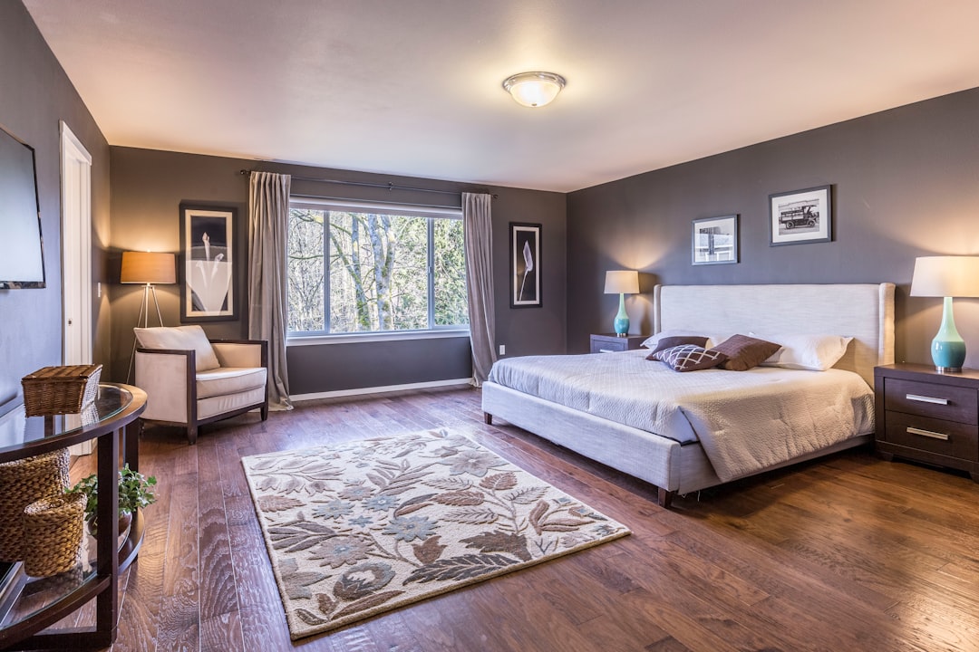
Choosing the right bedroom paint colors is less about chasing trends and more about supporting rest. The bedroom is the one room where the wall colour should work quietly in the background, easing you toward sleep at night and a gentle start in the morning. Get the hue, undertone and finish right, and the room feels settled before you have placed a single piece of furniture.
This guide walks through the colours that tend to work, why undertones matter more than the name on the tin, and the small testing habits that prevent expensive mistakes. The aim is a room that feels calm in every light, not just in the showroom.
What makes a bedroom colour work
A bedroom is viewed mostly in low light, at the edges of the day. That changes how you should judge a colour. A shade that looks crisp at midday can turn cold under a bedside lamp, while a warm neutral can glow softly in the evening. Because you spend so many hours here with the curtains drawn, the colour needs to hold up under artificial light as much as daylight.
The other quality that matters is restfulness. Highly saturated, vivid colours stimulate the eye and the mind, which is the opposite of what a bedroom asks for. Most people sleep better surrounded by muted, slightly desaturated tones. That does not mean the room must be pale or beige; it means choosing colours with a little grey or softness mixed in rather than pure, electric pigments.
Calming hues that suit most bedrooms
A handful of colour families consistently produce a calm bedroom. None of them are difficult to live with, and all of them pair easily with timber, linen and natural materials.
- Soft blues: gentle, slightly greyed blues are among the most restful bedroom paint colors. They recede visually and feel cool without being clinical.
- Sage and muted greens: green sits between warm and cool, which makes it forgiving. Sage and eucalyptus tones bring a quiet, natural feeling.
- Warm off-whites and greige: not stark white, but white softened with a touch of cream, stone or grey. These keep a small room feeling open.
- Muted earth tones: clay, oatmeal, mushroom and soft terracotta wrap a room in warmth and suit bedrooms that get little direct sun.
- Dusty mauve and taupe: understated and grown-up, these add depth without shouting.
If you are drawn to a darker, more enveloping bedroom, deep navy, forest green and charcoal can be wonderful, provided the lighting is warm and layered. A dark bedroom reads as cosy rather than gloomy when the lamps are generous.
Undertones matter more than the name
The single most common mistake is judging a colour by its label. “Grey”, “white” and “beige” each hide a spectrum of undertones, and the undertone is what you actually live with. A grey can lean blue, green, violet or brown; a white can lean yellow, pink or blue. Two greys that look identical on the lid can clash badly on opposite walls.
To read an undertone, place a sample beside a pure white card and beside the fixed elements of your room, such as flooring, wardrobes and bedlinen. The contrast reveals the bias. Cool undertones suit rooms with abundant daylight and modern, crisp interiors; warm undertones flatter rooms with limited light and natural textures. Matching the undertone to your flooring and woodwork is what makes a scheme feel intentional rather than accidental, a principle that runs through good interior design.
Sheen and finish
Finish is as important as colour, and easy to overlook. The sheen changes how light bounces off the wall and how forgiving the surface is.
- Matt: the usual choice for bedroom walls. It hides minor imperfections and gives colour a soft, velvety depth, which suits a restful room.
- Eggshell or low-sheen: a touch more durable and wipeable, useful in children’s rooms or where walls get touched often.
- Satin and semi-gloss: best reserved for trim, skirting and doors, where a little sheen adds crispness and stands up to cleaning.
As a rule, the flatter the finish, the calmer and richer the colour appears, but the harder it is to wipe clean. For most adults’ bedrooms a quality matt emulsion on the walls with an eggshell or satin trim strikes the right balance.
Ceilings, trim and accent walls
The fifth wall
Ceilings are usually painted a flat white by default, but in a bedroom you lie down and look straight at them. A ceiling carried in a soft white, or a paler version of the wall colour, can make a low room feel taller and a tall room feel cosier. In a dark, enveloping bedroom, taking the wall colour up and over the ceiling removes the harsh line where deep walls meet a bright ceiling, which only emphasises the contrast.
Accent walls, used sparingly
A single accent wall can add focus, ideally the wall behind the bed, so the colour frames the headboard rather than facing you as you fall asleep. Keep the accent within the same family as the main walls, or choose a deeper tone of the same hue, and avoid a jarring colour that fights the room. If you prefer a quieter approach, an accent in texture, through panelling or a tactile finish, can be more restful than a contrasting colour. The discipline of restraint here echoes the calm logic of a traditional Japanese house, where materials and tone carry the mood.
How to test swatches properly
Never commit to a bedroom colour from a small chip under shop lighting. Buy sample pots and test on the actual walls. The method matters.
- Paint two coats on a large patch, at least A3 size, or on a board you can move around the room.
- Place samples on more than one wall, since light hits each wall differently.
- Live with them for two or three days, observing morning, midday, evening and lamp-lit light.
- Keep test patches away from strong existing colours that can throw your eye off.
- Look at the colour beside your bedlinen, curtains and flooring, not in isolation.
Colours shift dramatically between north-facing and south-facing rooms, and between cool and warm light bulbs. A few days of patience at the sample stage saves you repainting an entire room. If you are repainting as part of a wider refresh, it helps to understand how finishes feed into overall renovation costs in Singapore before you commit.
Common mistakes to avoid
A few recurring errors undo otherwise good colour choices. Being aware of them is half the battle.
- Choosing colour first, light second. Always test in your own room’s light, not the showroom’s.
- Going too bright. Vivid, saturated colours stimulate rather than soothe. Mute the hue for a bedroom.
- Ignoring fixed elements. Flooring, wardrobes and built-ins set the undertone you must work with.
- Forgetting the ceiling. A default bright white can clash with warm or deep walls.
- Skipping the trim. Tired, yellowed skirting and doors make even a fresh wall colour look dull.
Frequently asked questions
What are the most calming bedroom paint colors?
Soft, slightly desaturated blues, sage and muted greens, warm off-whites and gentle earth tones tend to be the most calming because they are restful to the eye and pair easily with natural materials and bedlinen.
Should the ceiling be a different colour from the walls?
It can be, but a softer white or a paler shade of the wall colour usually works better than a stark bright white, especially with warm or deep walls, because it avoids a harsh line and keeps the room feeling cohesive.
Is a dark colour a bad idea in a small bedroom?
Not at all; a deep navy, green or charcoal can make a small bedroom feel cosy and enveloping rather than cramped, provided you layer in warm lighting and generous lamps so the room never reads as gloomy.
What sheen should I use on bedroom walls?
A quality matt emulsion is the usual choice for bedroom walls because it gives colour a soft depth and hides minor imperfections, while an eggshell or satin finish suits trim, doors and skirting that need to be wiped clean.
How many sample pots should I test?
Test two or three shortlisted shades on large patches on more than one wall, and observe them across daylight and lamplight for a few days before committing, since bedroom colours shift noticeably between morning, evening and artificial light.
Related reading
- How to Choose an Area Rug: A Practical Guide
- Types of Window Blinds Explained for Every Room
- Types of Curtains and Drapes: A Buyer’s Guide
- Curtains vs Blinds: Which to Choose for Your Home
Planning a calmer bedroom and want a considered, accountable approach? Talk to our consultancy or get in touch.


